How to Create Charts in Excel — Complete Guide (2026)


You create a chart in Excel by selecting your data, opening the Insert tab, and choosing a chart type — the whole process takes under two minutes once you know where to click. As of Excel 365, there are more than 15 built-in chart types, from simple column charts to combo and waterfall charts. This guide walks you through the entire process step by step, including PivotCharts, formatting, and the mistakes most people make along the way.
Let me guess.
You've got a spreadsheet full of numbers, and you have no idea how to turn them into something a human being would actually want to look at.
I get it.
Numbers on their own are boring. But the second you turn them into a chart in Excel, they start telling a story.
Let's get into it.
Why Charts in Excel Actually Matter
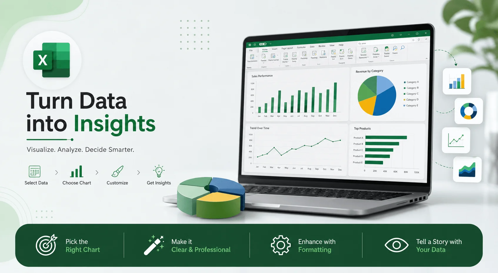
A chart isn't decoration — it's a shortcut for your reader's brain. When you present raw numbers, you're asking people to do math in their heads. When you show them a column chart or a line chart, you're doing that math for them, visually. That's a massive difference, and it's why charts remain one of the most requested skills in Excel training courses today.
Charts help you spot trends, compare categories, and catch outliers that would otherwise hide in a sea of cells. If you're building a report, a dashboard, or a budget, a well-built Excel chart turns "here's some data" into "here's what this actually means."
Step 1: Get Your Data Ready Before You Touch the Insert Tab
Here's a mistake almost everyone makes: they try to build a chart before their data organization is clean.
Messy data — blank rows, missing headers, inconsistent formatting — leads to broken or misleading charts. Before anything else, make sure your dataset has:
Clear column headers (these become your chart labels)
No blank rows or columns in between your data
Consistent formatting (dates as dates, numbers as numbers)
This single step saves you from most of the headaches people run into later.
Quick Tip: Include Your Headers
When selecting your range, always grab the header row too. Excel uses those headers to automatically label your axis titles and legend, saving you manual editing afterward.
Step 2: Select Your Data
Click and drag to highlight the range you want visualized. If your data is one continuous block, this is as simple as clicking the top-left cell and dragging to the bottom-right one.
If your data isn't continuous — say you only want two out of five columns — hold Ctrl and select each section individually. Excel treats them as one connected dataset when building the chart.
Step 3: Insert Your Chart
Go to the Insert tab on the ribbon.
Look for the Charts group.
Pick a specific chart type directly, or click Recommended Charts and let Excel do some of the thinking for you.
Excel's Recommended Charts feature scans your selection and suggests a shortlist, letting you preview each one before committing.
You can also select your data and hit ALT + F1 for an instant chart — though it might not be the ideal type, so don't treat it as your final answer.
Step 4: Choose the Right Chart Type
Picking the wrong chart type doesn't just look odd — it can actively mislead your reader. Here's a quick comparison to help you decide:
Chart Type | Best For | Data Shape Needed | Avoid When |
|---|---|---|---|
Column | Comparing values across categories | Few categories, one or more series | Too many categories (10+) |
Bar | Comparing values with long category names | Categorical, horizontal labels | Time-series data |
Line | Showing trends over time | Continuous, time-based data | Small number of data points |
Pie | Showing proportions of a whole | Single series, parts of 100% | More than 5–6 categories |
Combo | Comparing two different measures together | Two series with different scales | Single-measure data |
Waterfall | Showing cumulative effect of sequential values | Running totals, increases/decreases | Simple category comparisons |
Column Charts
Best for comparing values across categories — monthly sales, department budgets, product performance side-by-side.
Line Charts
Best for showing trends over time — website traffic, revenue growth. If your x-axis is time-based, a line chart is almost always the answer.
Pie Charts
Best for showing proportions — like how your monthly budget splits across categories. Avoid pie charts with more than 5–6 slices; they turn into a confusing mess fast.
Bar Charts
A horizontal column chart. Useful when category names are long.
Combo Charts
Want to show two data types on one chart — sales as columns and profit margin as a line? A combo chart layers chart types on the same visual.
Step 5: Customize Your Chart
This is where chart formatting comes in. Excel gives you three dedicated tabs once your chart is selected: Design, Layout, and Format.
Add a Chart Title
Click the default placeholder title and type something meaningful. "Chart Title" tells nobody anything — "Q3 Regional Sales" does.
Adjust Axis Titles
Clear axis titles remove ambiguity about what your reader is looking at.
Move or Style the Legend
Click the "+" (Chart Elements) button next to your chart, hover over Legend, and choose a position.
Add Data Labels
Data labels display the actual value right on the chart — useful when precision matters in a report.
Try a Trendline
For time-based data, a trendline shows the overall direction instantly, without requiring your reader to scan every point.
Step 6: Move or Resize Your Chart
Click a blank part of the chart border, then drag it wherever you want on the sheet. To resize, grab a corner handle and pull.
Want it on its own sheet? Right-click the chart, choose Move Chart, and select "New Sheet."
Level Up: How to Build a Pivot Chart
Basic charts are great for small, static datasets. But for large, constantly changing data, you want a PivotChart.
A PivotChart is a chart version of a PivotTable — dynamic, interactive, and directly linked to your summarized data. You can filter it, slice it, and drill into segments, and the chart updates instantly.
The catch: a PivotChart can't exist without a PivotTable behind it. So the process looks like this:
Build your PivotTable first.
Select any cell inside it.
Go to PivotTable Analyze > PivotChart.
Choose your chart type and hit OK.
One thing that trips people up: if you add new rows to your source data, your PivotChart won't automatically reflect them. You need to right-click and refresh the PivotTable first. Skip that, and you'll be staring at outdated numbers wondering why nothing changed.
Common Mistakes People Make With Excel Charts
Most chart mistakes aren't technical — they're judgment calls that go wrong.
Using a pie chart for too many categories. Past six slices, it stops being readable.
Skipping axis labels. If someone has to guess what the numbers mean, the chart has failed at its one job.
Not cleaning data before charting. Blank cells or inconsistent formats create charts that lie, even accidentally.
Overcomplicating with 3D effects. They look flashy but distort how the data actually compares.
Forgetting to refresh PivotCharts. Outdated data is a silent killer of good reports.
FAQ: Creating Charts in Excel
What's the fastest way to make a chart in Excel?
Select your data and press ALT + F1. It's instant, though not always the best chart choice for your data.
Can I change a chart type after I've created it?
Yes. Right-click the chart and select Change Chart Type, then pick any option from the dialog.
What's the difference between a chart and a PivotChart?
A regular chart is static once created, based on a fixed range. A PivotChart is dynamic and linked to a PivotTable, so it can be filtered and refreshed as your underlying data changes.
Which chart type should I use for comparing categories?
Column or bar charts work best for category comparisons, especially with more than a few items.
How do I add a trendline to my chart?
Click your chart, hit the "+" button, and check Trendline from the list of chart elements.
How many chart types does Excel offer in 2026?
Excel 365 currently offers more than 15 built-in chart types, including combo, waterfall, and bullet charts, in addition to the standard column, line, pie, and bar options.
Wrapping Up
Charts turn confusing spreadsheets into visuals people actually understand at a glance. Start with clean data, pick the right chart type using the comparison table above, and don't skip the small customization steps — labels, titles, and legends make a bigger difference than you'd think.
Once you're comfortable with basic charts, PivotCharts are the natural next step for anything data-heavy or constantly updating.
Now go build one. You've got everything you need.
Read more: Remove Duplicates in Excel: Complete 2026 Guide
Written by
Alex
Creative blogger sharing insights, stories, and fresh ideas.